When the Data Disagrees

Introducing mobile-first thinking and clearer, simpler experiences to a brand-driven commerce environment where design decisions had long been driven by preference, not evidence.

Vermont Teddy Bear is a premium gift and lifestyle brand with a deeply loyal customer base and a strong visual identity. In a highly competitive market, the brand had always leaned into rich, expressive design to reinforce its premium positioning. Over time that approach had introduced complexity: layered promotions, animation-heavy components, and a desktop-first experience in a world where more than 70% of traffic was coming from mobile. The challenge wasn't to reinvent the brand. It was to bring clarity to it.

  • Role:
  • Senior UX Designer
  • Scope:
  • UX modernization, mobile-first design, cross-functional education

The Problem: Preference Over Evidence

Vermont Teddy Bear had built a beautiful brand, and a complicated website. Years of design decisions made by multiple contributors had layered promotional messaging, animation-heavy components, and desktop-first layouts onto a platform that was seeing more than 70% mobile traffic. The site looked premium. But for a user on a phone trying to find and buy a gift, it was working against them. The data showed it. The internal design process didn't reflect it.

Key challenges:

  • Layered promotional messaging creating visual noise
  • Animation-heavy components competing for attention
  • Desktop-first layouts serving a 70%+ mobile audience
  • No structured testing framework to validate or challenge decisions

The Thinking

The goal wasn't to strip the brand down. Vermont Teddy Bear's visual identity was a genuine asset. The challenge was to introduce structure without losing what made the brand special.

The first and most significant decision: shift the homepage focus back to the product. Animations and brand content had taken priority over product visibility — the most trafficked page on the site was doing everything except showing people what to buy. Removing the noise while keeping the personality created the clarity the experience needed.

From there, data became the common language — shifting internal conversations from 'I think' to 'the evidence shows.'"

The redesign focused on restoring hierarchy and clarity while preserving brand integrity.

The Solutions

Simplifying the Experience

The redesign centered on one principle: get out of the user's way.

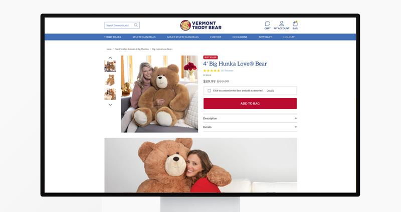
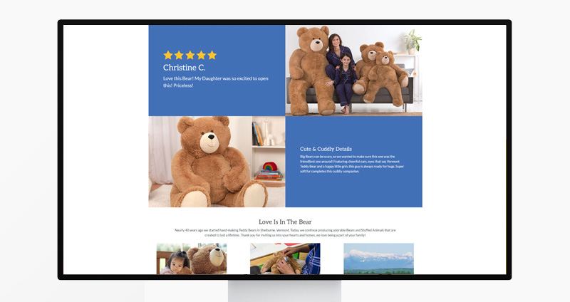
Navigation was simplified to reduce friction in product discovery across a large catalog — making it easier for users to find what they were looking for without getting lost. Animation density was reduced and homepage real estate was redistributed to prioritize product visibility, giving users a clearer path to purchase and the business a more direct line to conversion.

Promotional placements were rationalized — fewer, more intentional moments rather than layered messaging competing for attention. Every layout decision was made mobile-first, reflecting where more than 70% of traffic actually was.

Building a Mobile-First Culture

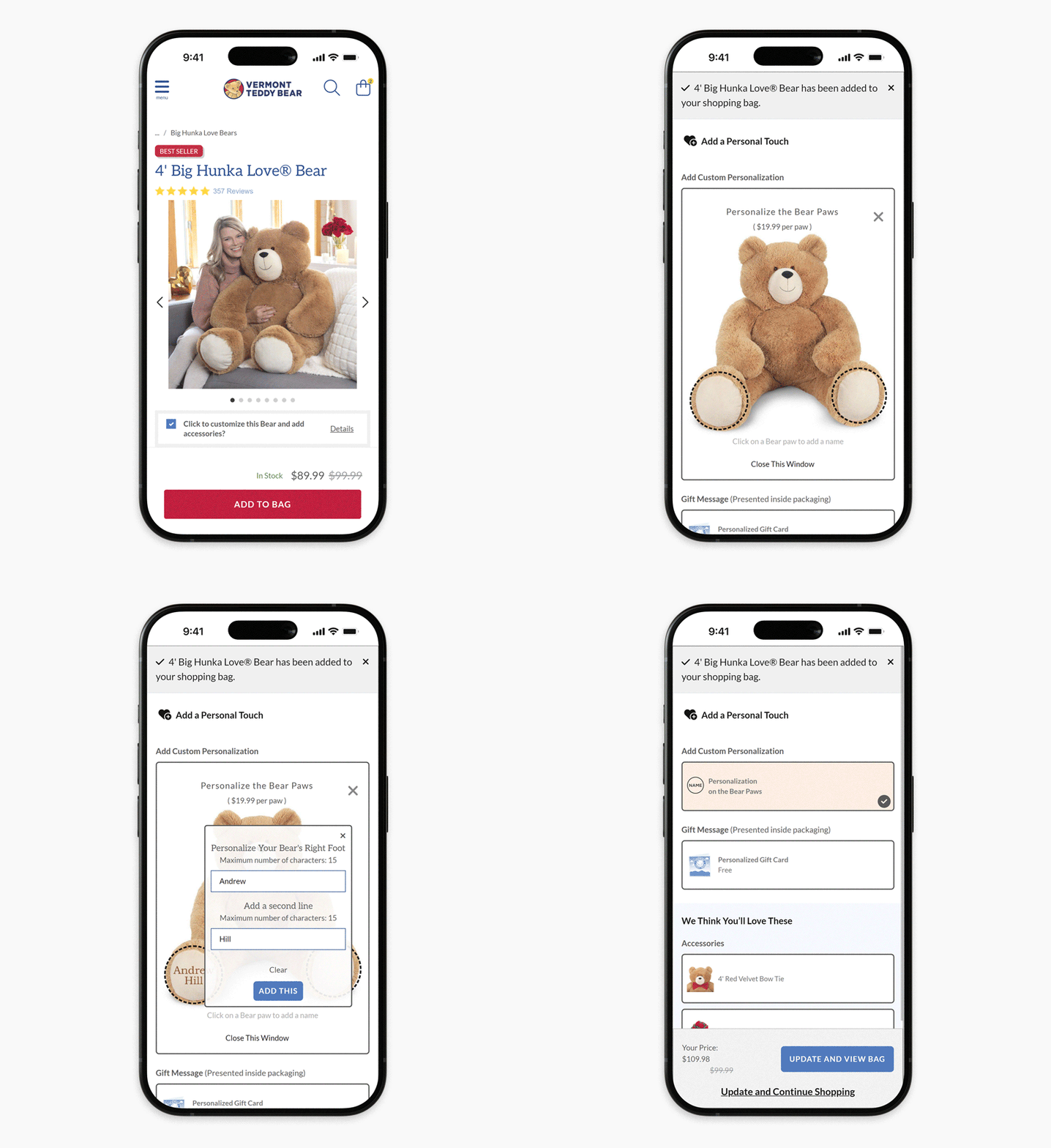
The shift started with a simple idea: meet users where they are. More than 70% of traffic was coming from mobile — yet desktop-first thinking was deeply embedded, not out of resistance but habit. Changing it required one rule: mobile designs were always presented first. Over time, 'how does this work on mobile?' became part of every design conversation.

From there it became a rule, not a suggestion — this is how we design now.

Outcomes

This project wasn't measured in a single conversion lift. It was measured in how the team changed and what the data consistently pointed toward.

  • Structured experimentation surfaced a single behavioral insight that drove a 30%+ peak-season conversion lift
  • Increased browse depth across categories
  • Higher add-to-cart activity
  • Significant lift in mobile engagement
  • Promotional placements became more intentional, reducing visual noise across the experience

Reflection

This project marked a turning point — from executing to leading. 'Meet users where they are' became a design philosophy that persisted well beyond this project, changing how the organization made decisions. That kind of shift, from preference to evidence, from brand-first to user-first, is the work that stays with me.

Up Next:
Read Case Study

Early Lessons in Design Leadership - Introduced prototyping workflows, design systems, and real-time collaboration to a multi-brand organization, years before they became standard practice.

Read Case Study