Launching Stable, Building for What Comes Next

Constrained by timeline, focused on stability, a launch decision that created the foundation for lasting gains, including 30% faster page speeds and a 50% reduction in marketing execution time within six months.

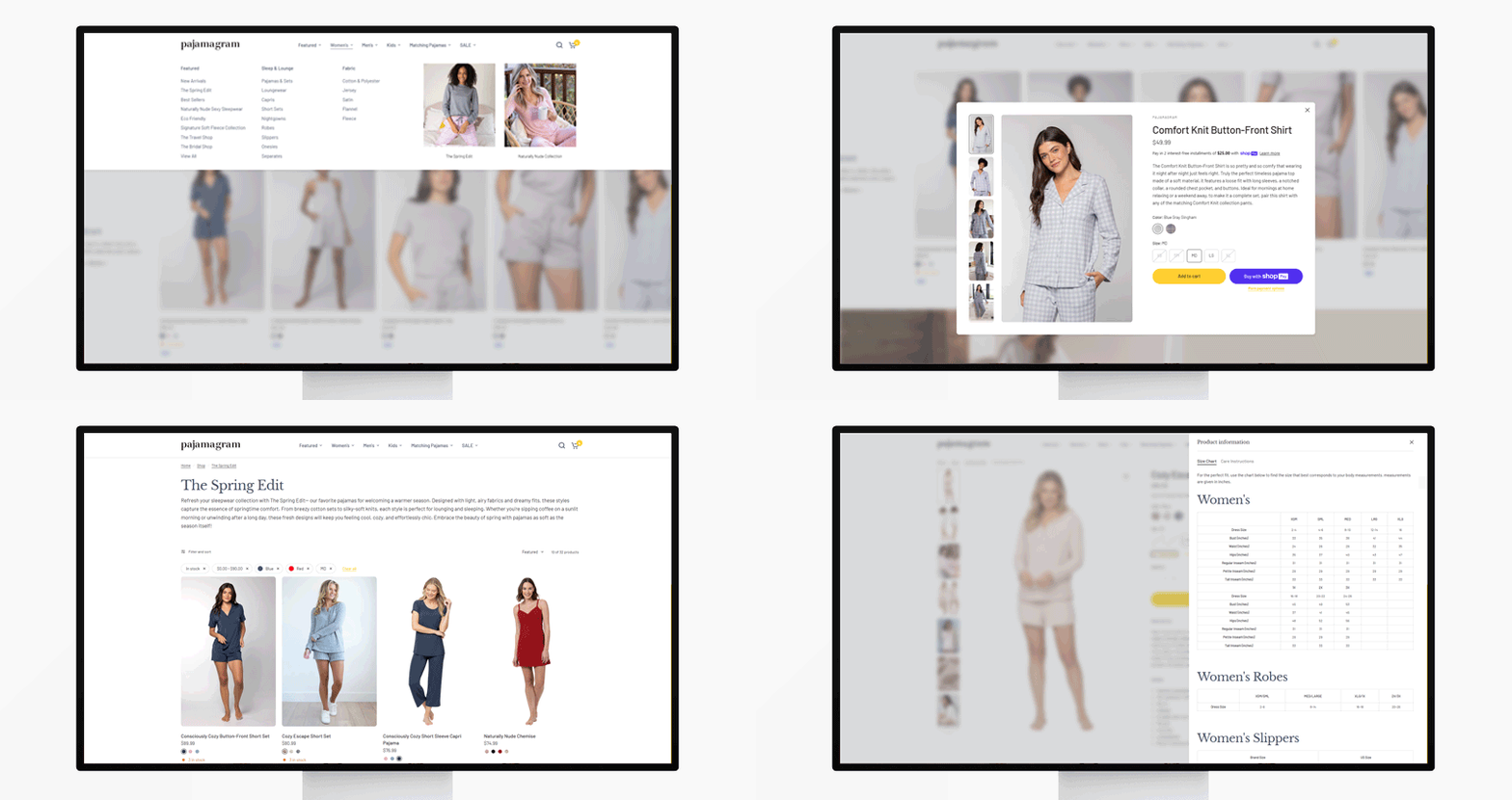
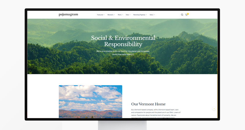
An ownership transition in 2024 required a migration from Salesforce Commerce Cloud to Shopify on an aggressive timeline. The primary objective was simple: launch stable. As the lead UX designer, I evaluated and selected the Shopify theme architecture, standardized the site experience, and built the design systems that would give teams the autonomy to operate independently after launch.

  • Role:
  • Senior UX Designer
  • Scope:
  • Platform migration, UX design, design systems, team enablement
The Problem: Complexity Without Purpose

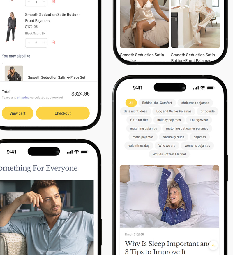
The migration wasn't just a platform change — it was an opportunity. Pajamagram, along with its sister brands PajamaJeans and The1ForU, had accumulated years of complexity throughout the shopping experience. The path to purchase was bloated and mobile performance lagged behind traffic that was nearly 75% mobile. The move to Shopify created the conditions to finally normalize the experience.

The Thinking

I approached theme selection as a systems decision first, and the visual transformation followed. After 13 years with the brand, I understood our users — how they behaved, what they expected, and where they dropped off. That knowledge, combined with competitive analysis and current design trends, shaped a clear set of criteria:

  • Mobile-first architecture
  • Accessibility compliance
  • CMS flexibility for merchandising workflows
  • Modular structure that could scale

The selected theme provided a stable, performance-oriented foundation and the opportunity to build on it.

The Solutions

Simplifying the Experience

The move to Shopify was a chance to address what years of accumulated decisions had made difficult to change. Two improvements stand out.

The PZA upsell flow — validated as a friction point through behavioral testing on SFCC — was finally removed from the product page. Within six months of launch, the data reflected the change:

  • 22% increase in conversion
  • 18% reduction in bounce rate

Custom content slots added to the product page gave us the ability to surface enhanced brand and product information at the moment of decision. Users got purchase confidence. The business saw increased engagement and add-to-cart rates.

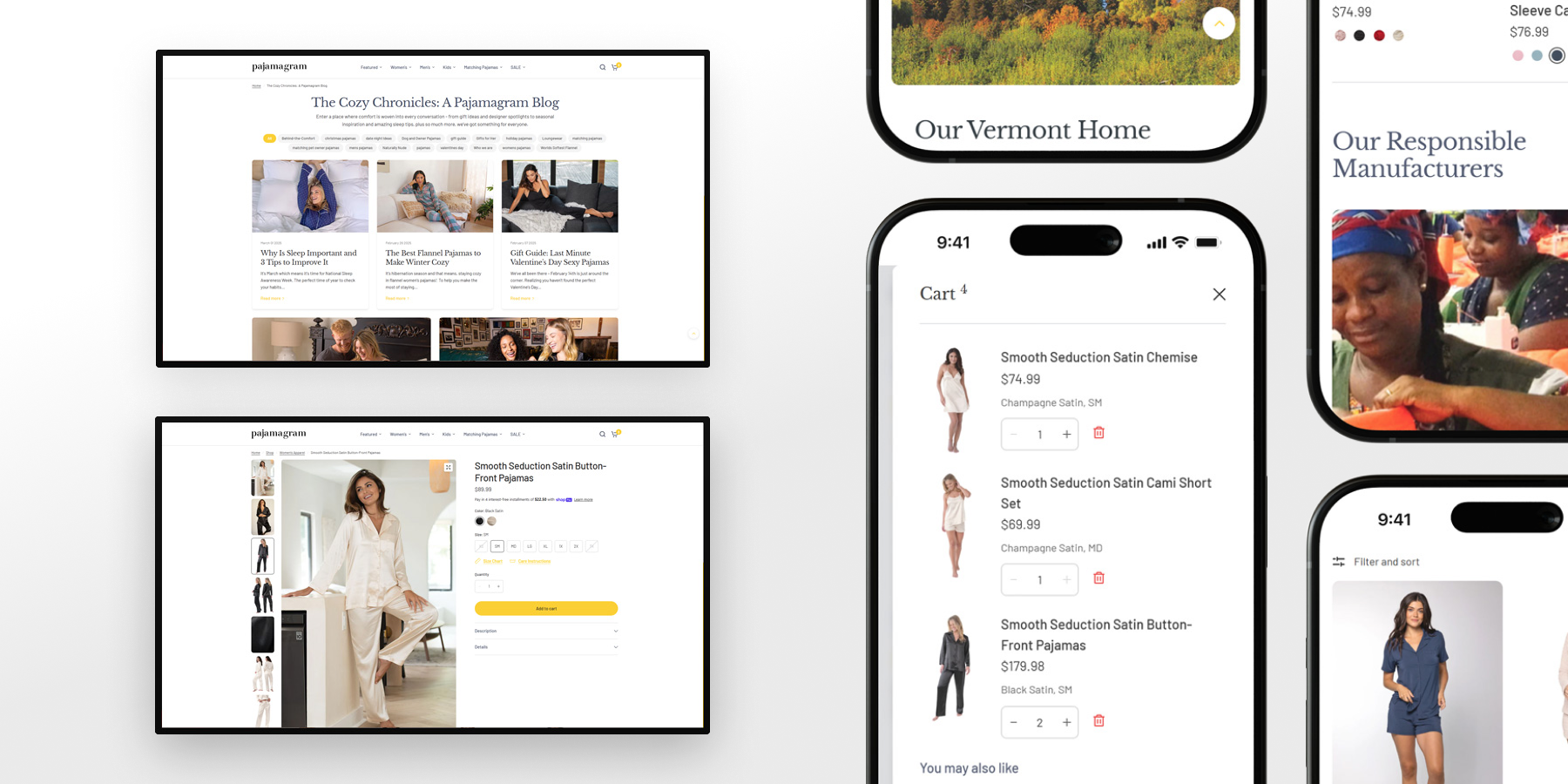
Every other change — homepage, PLP, PDP structure — followed the same principle: less noise, more clarity, a normalized experience that got out of the user's way.

Building for Autonomy

Alongside the site redesign, I built two interconnected design systems. The first was a full design system for the internal creative team, covering typography, color, components, and promotional frameworks. The second was a section layout system for merchandising and marketing teams, defining approved layouts, responsive standards, and guardrails for content deployment.

After implementation, I trained both teams on usage, constraints, and tradeoffs. For the first time, teams could quickly mockup homepage and promotional updates independently, giving everyone visibility into site changes before they went live. The design systems reduced the time and friction involved in campaign execution, cutting marketing execution time by 50%.

Outcomes

The site redesign and design systems work produced measurable gains across both user experience and business operations.

  • 22% increase in conversion
  • 18% reduction in bounce rate
  • 30% improvement in page speed
  • 50% reduction in marketing execution time
  • Teams could mockup and preview site updates accurately before they went live, for the first time
  • Cross-team visibility improved significantly, reducing back-and-forth and speeding up approvals
  • Shared design constraints kept all three brands consistent without sacrificing flexibility

Reflection

This project reinforced something I suspected but hadn't seen so clearly before: for this brand and audience, normalization was the right strategy. Removing complexity from the path to purchase produced more dramatic results than I anticipated, a reminder that what you take away can matter as much as what you add.

The design systems work reinforced a second lesson: systems built for clarity and constraints don't just help designers, they change how entire organizations operate and communicate. Both of those ideas now shape how I approach every project.

Up Next:
Read Case Study

When the Data Disagrees - Introduced mobile-first thinking and evidence-based design to a brand-driven commerce environment — changing how the team made decisions.

Read Case Study